Genie
Genie is an AI content production platform for game studios, helping creative teams scale their game art while staying on brand.
Homepage concept
I developed this brand refresh as part of a hiring assignment for GenieLabs, then independently expanded the system for this case study; building an expressive visual world designed to grow without losing its identity.
01
Brand Idea
Game studios need more content, more often — across events, markets and formats.
But speed means very little if every new asset drifts further from the world it belongs to. Genie helps creative teams scale production without surrendering control, keeping every output consistent, recognizable and on-brand.
02
The Visual Language
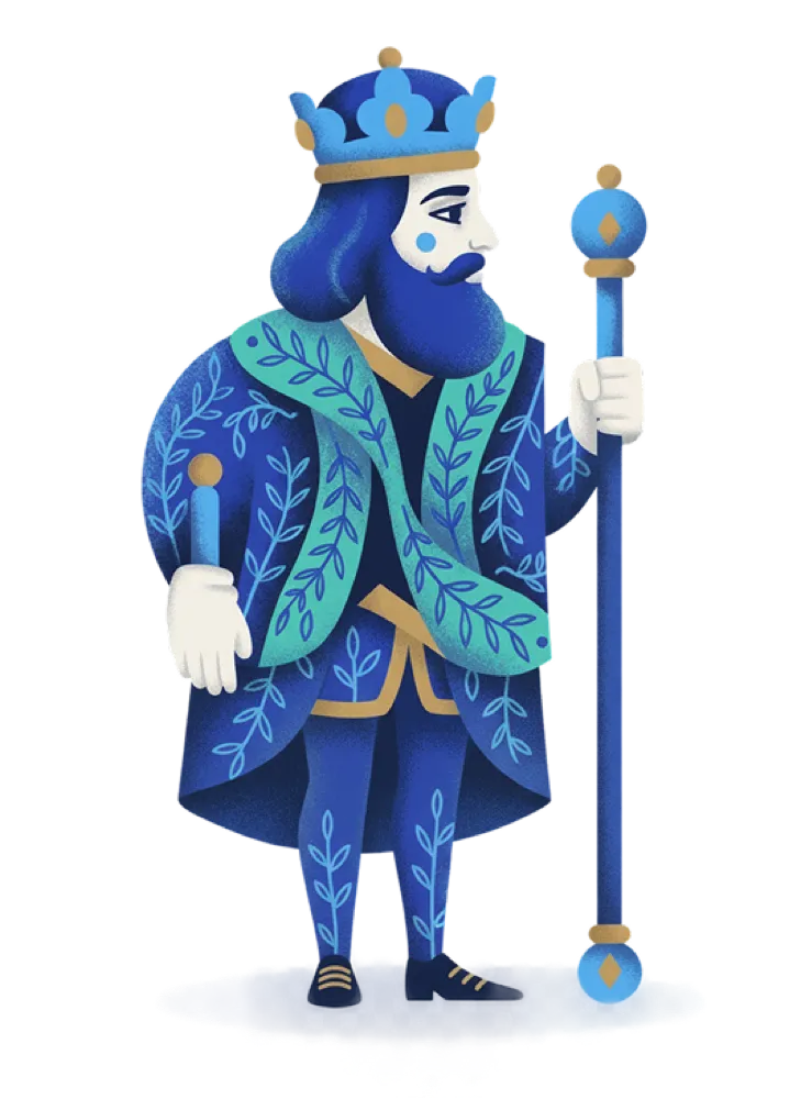
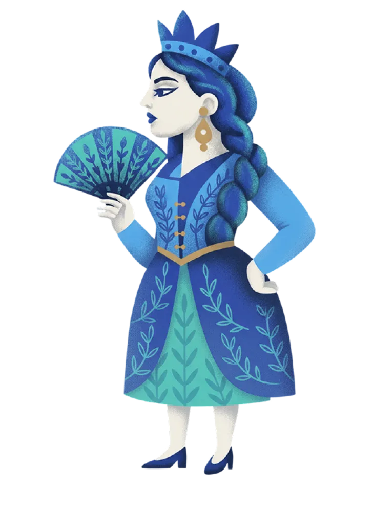
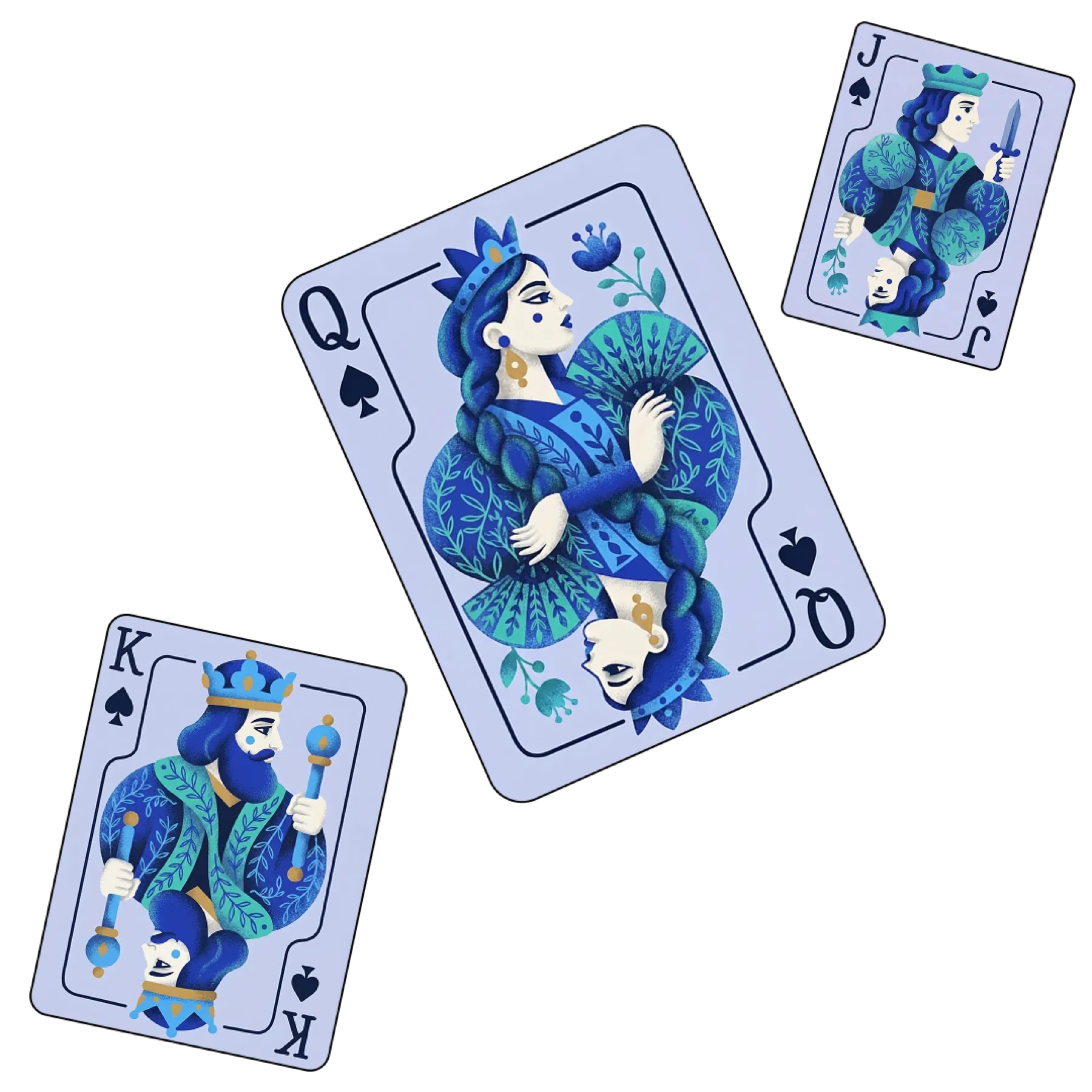
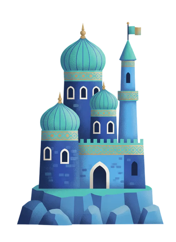
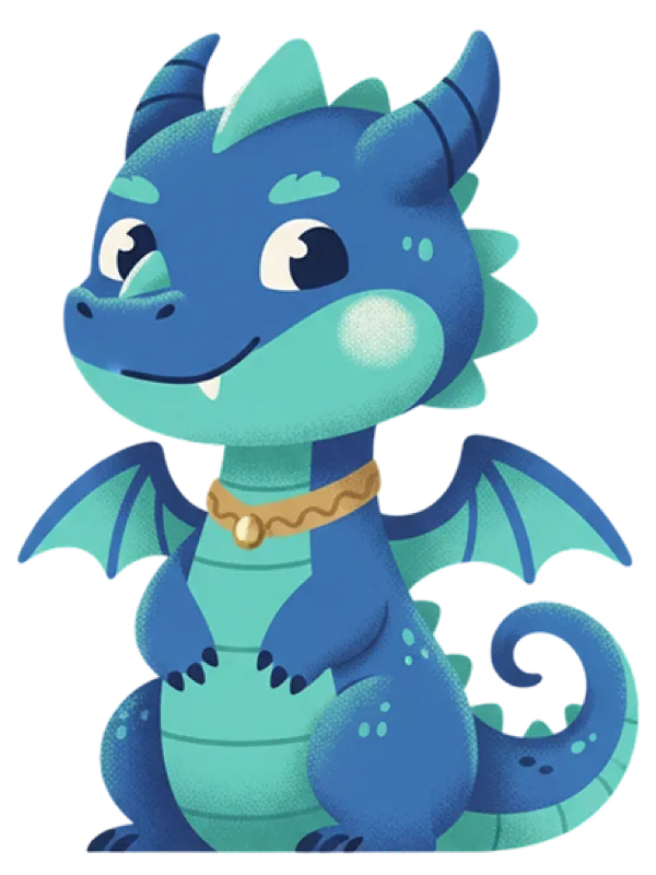
The visual language starts with a familiar game archetype — a deck of playing cards — and expands into characters, environments and objects. Repeating forms, ornamental details, grainy shading and a disciplined palette create a flexible image system that can evolve while remaining recognizably part of the same universe.
The imagery was developed through a generative art-direction process, using tightly defined visual rules to maintain consistency across new characters, props and scenes.


03
Building the Visual System
The expressive image world is supported by a tighter graphic system, refining the existing identity into a toolkit that feels playful, precise and practical in everyday use.
03.1 — Logo
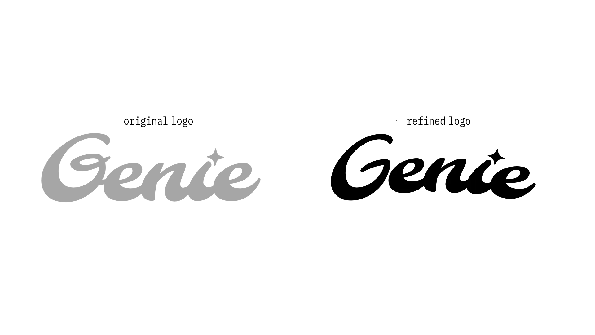
A familiar mark, tightened.
I kept the recognizable character of the original wordmark while simplifying the G, cleaning the G–E connection and creating a clearer, more balanced rhythm.
03.2 — Color
Rooted in the brand, expanded for the world.
Persian Blue remains the anchor, supported by off-white and black for clarity. Turquoise, sky blue and warm gold extend the palette into a richer and more expressive visual world.
#1C39BB
#45B3FD
#3FD1C0
#C9A151
#F6F3EE
#000000
03.3 — Typography
Expression meets production.
Clash Display carries the expressive brand voice, Archivo keeps everyday communication clear, and Datatype introduces a technical layer for labels, metadata and production cues.
H1 — Clash Display
For impact and personality. Used for large headlines and key brand statements, bringing confidence, energy and a slightly unexpected edge.
Grow the world
Body — Archivo
The primary reading typeface across body copy, UI-style content and supporting information — clean, neutral and highly legible.
Built for fast-moving game teams.
Genie helps creative teams produce more content without losing consistency. From campaign assets to localized variations, the system keeps every output clear, recognizable and on-brand.
System — Datatype
Used for labels, metadata, numbering and technical cues, giving the identity a precise, production-oriented layer and making the system behind the work visible.
PROJECT / ROYAL REWARDS | FORMAT: CAMPAIGN SET | VARIANTS: 24 | MARKETS: 8 | STATUS: READY
04 — Weeks → Hours
Brand in Motion
05
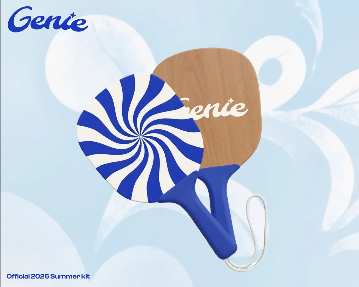
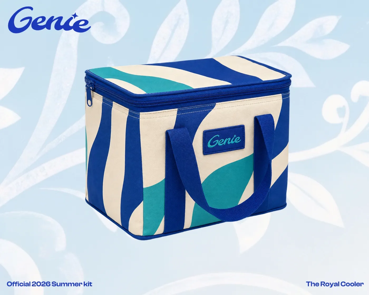
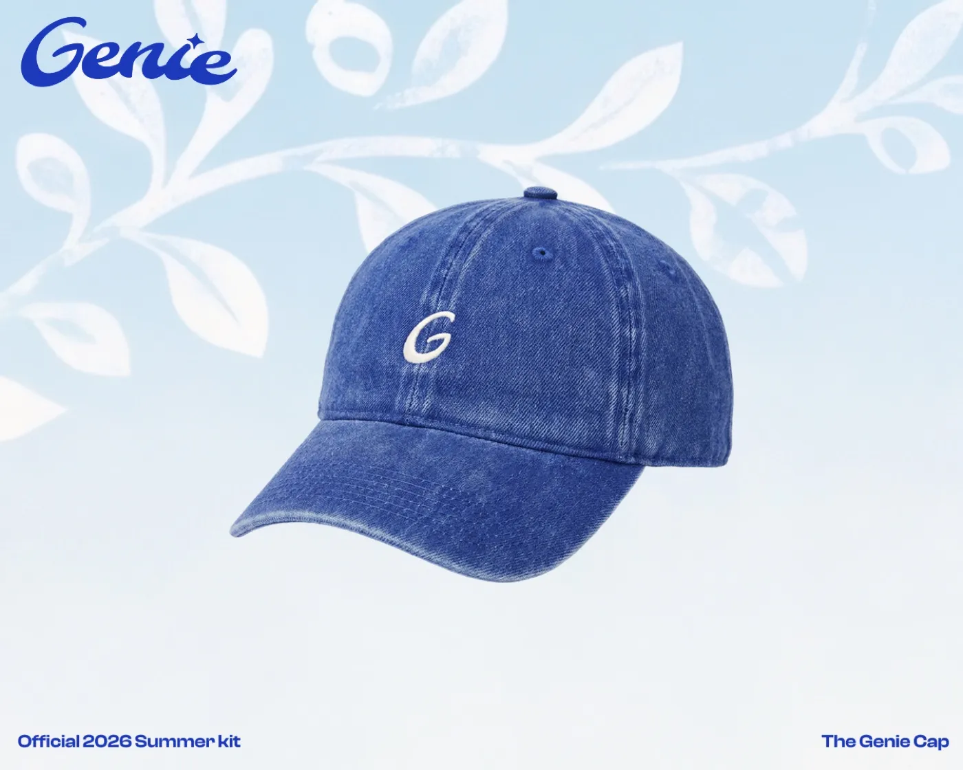
Genie Summer Edition
To test the identity beyond the screen, I extended the system into a small summer collection. The pieces rely on color, pattern, material and recognizable graphic details rather than oversized branding — allowing the identity to stay distinctly Genie in a different context.