Bezalel Rebrand Proposal
A rebranding proposal for Bezalel Academy of Arts and Design, built on a single typographic pattern in Hebrew, Arabic and English.
The angle
The brief was to propose a new identity for Bezalel — a speculative rebrand — and find an angle of our own. Mine came from multiculturalism and inclusion: Hebrew, Arabic and English, set at the same weight and with the same presence.
01
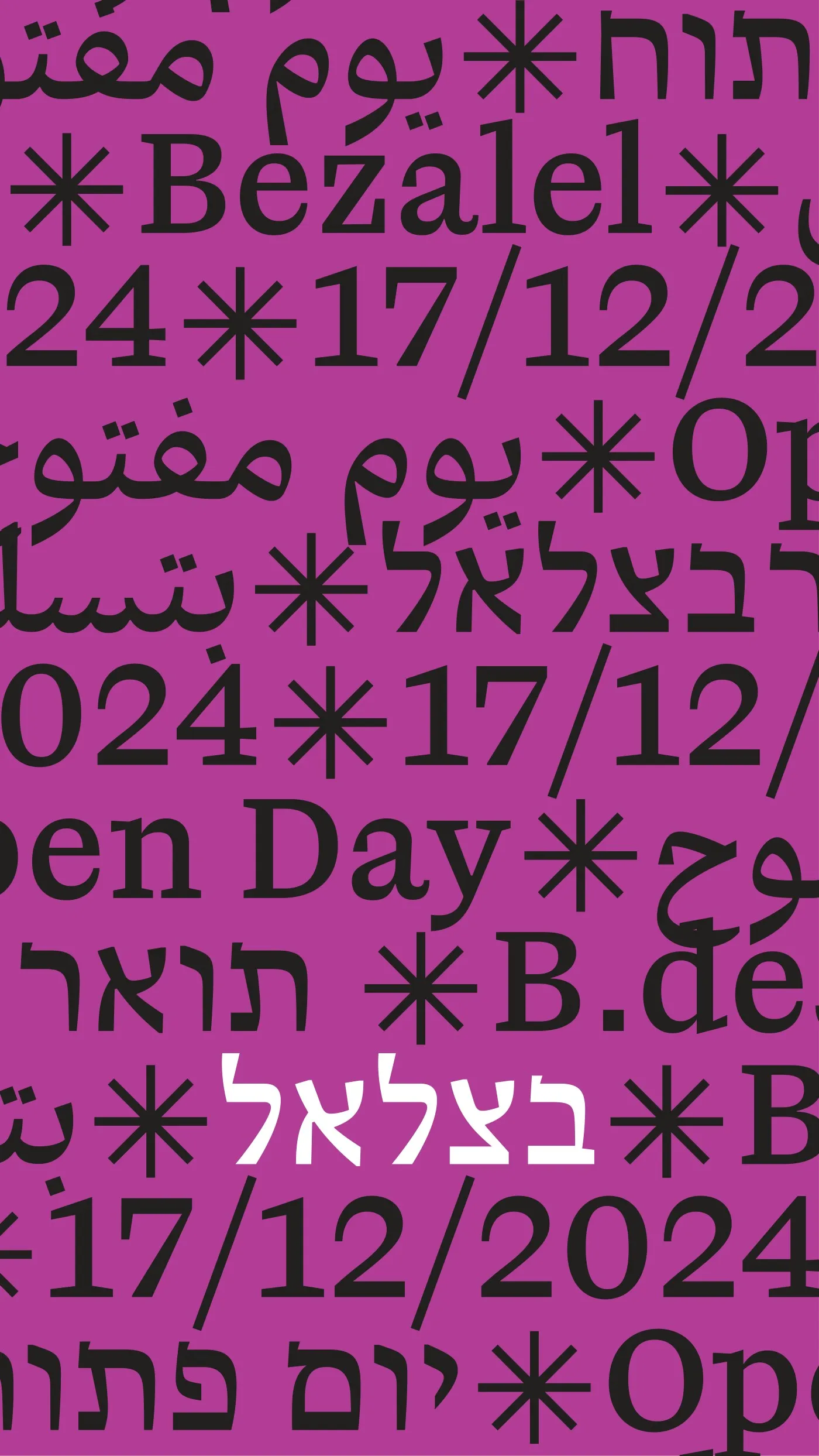
The Pattern
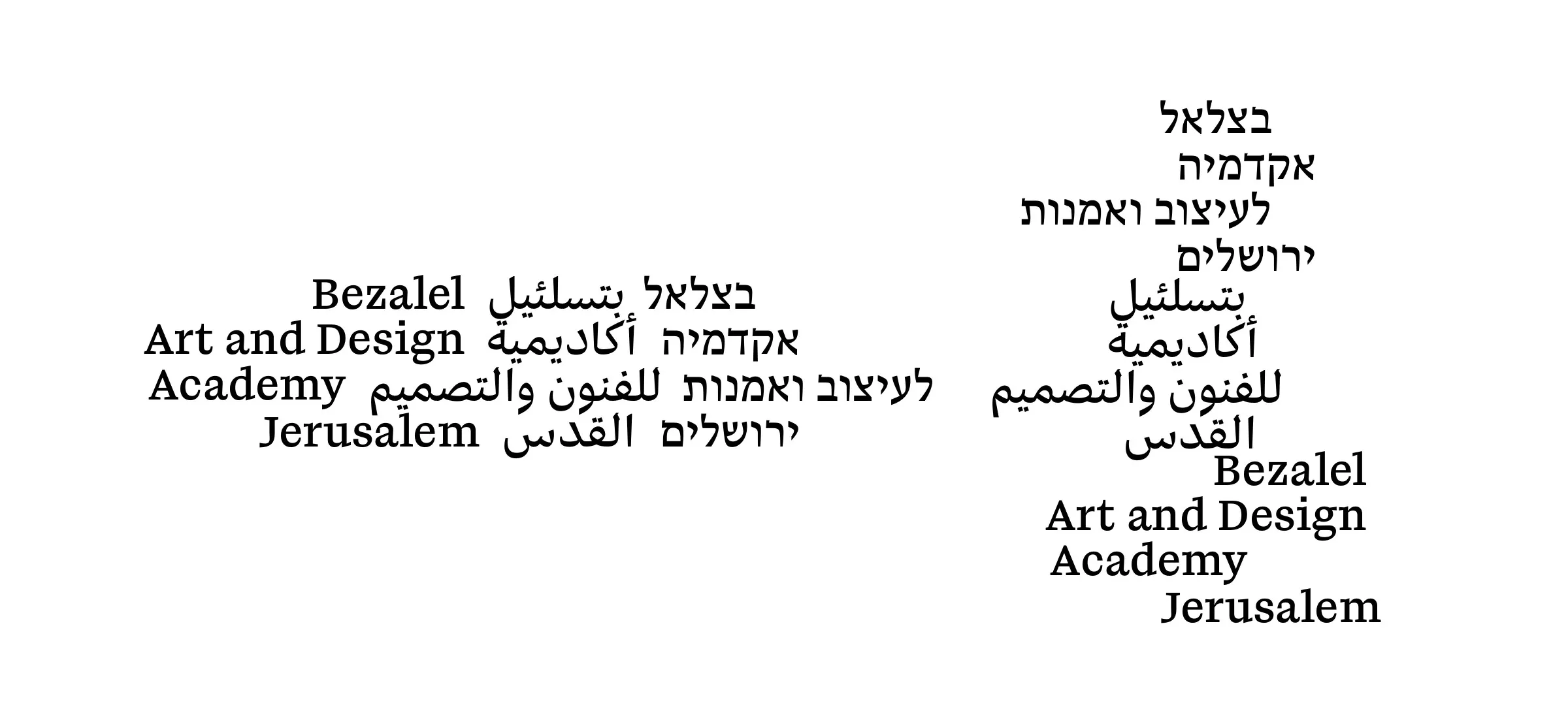
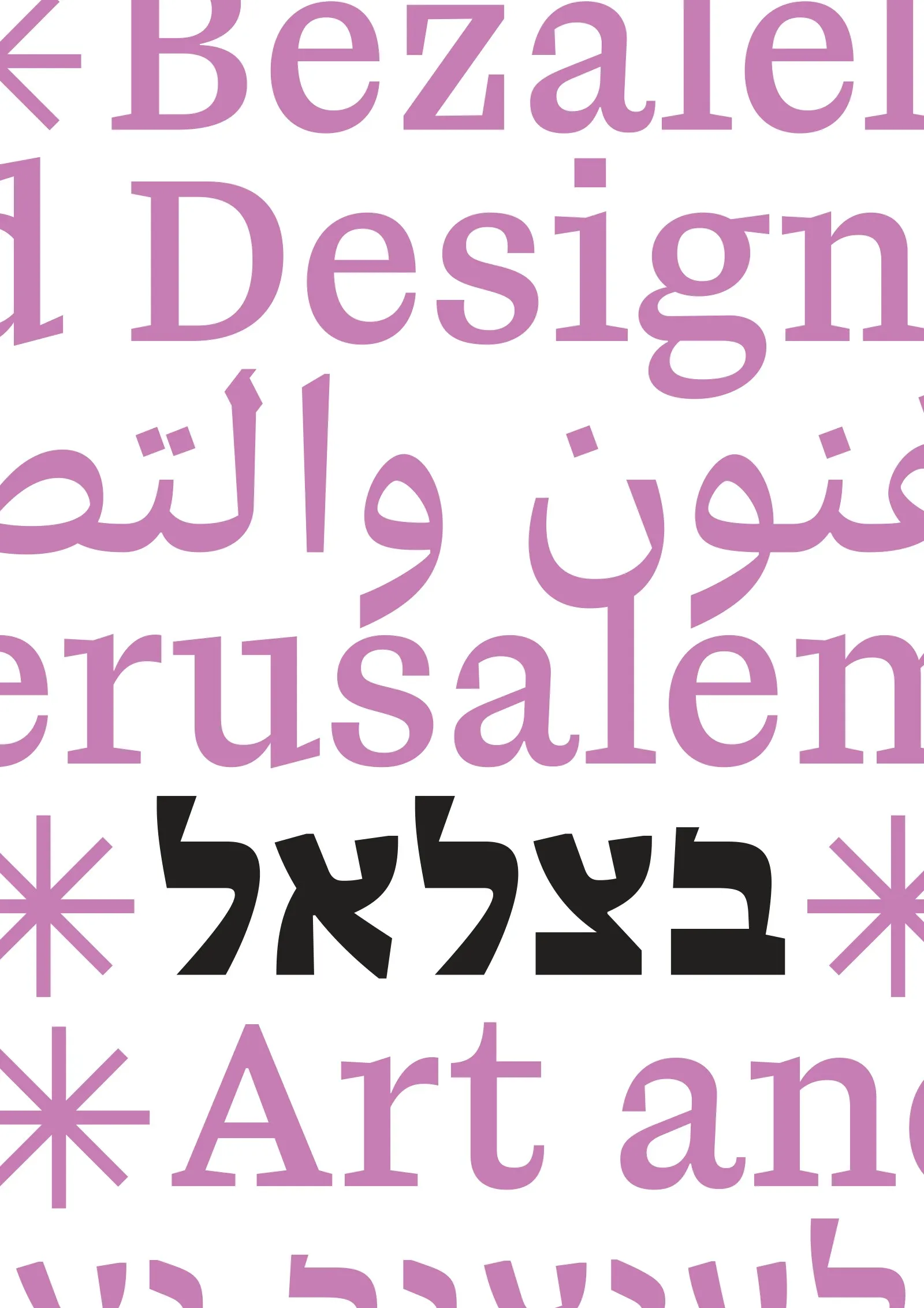
The academy's name — Bezalel, Academy of Art and Design, Jerusalem — repeats in three languages, separated by ✳, into a textual pattern. Lifting a block out of the pattern gives the logotype: a modular stack that can be rearranged.
02
What Stays, What Changes
The institution is the pattern. The images belong to the students.
Typography and pattern are fixed; everything else is free to change. Images always come from student work, credited and with consent — so the academy speaks through its pattern, and its students through the images. Color is deliberately left open — vivid and chosen per piece — so the pattern stays the one constant.
03
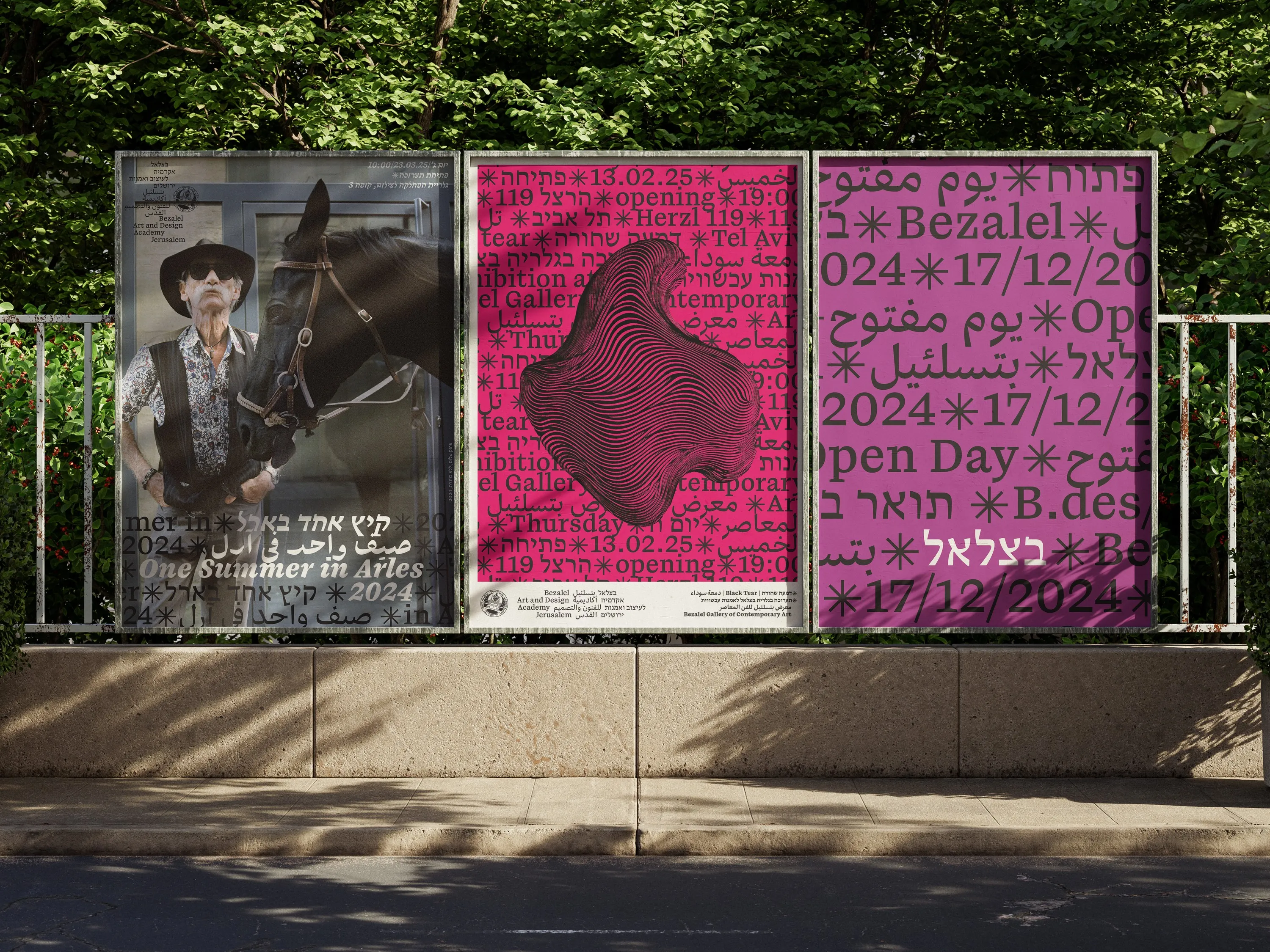
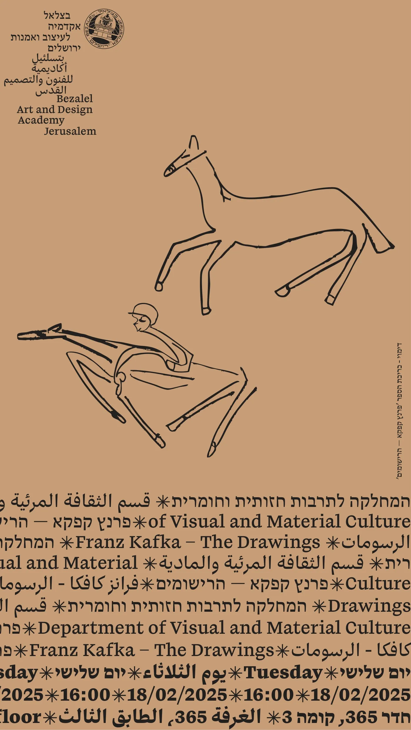
Posters
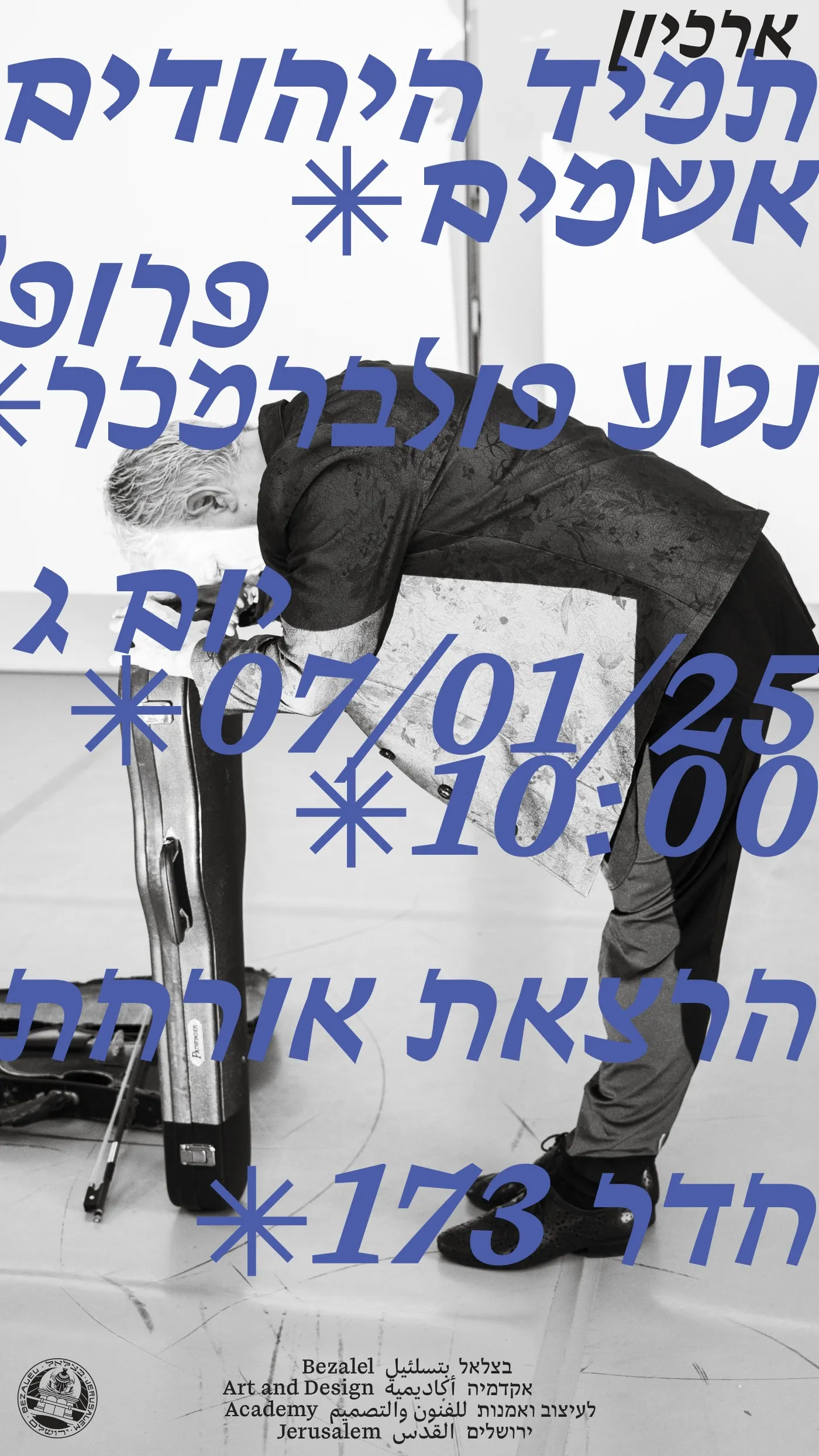
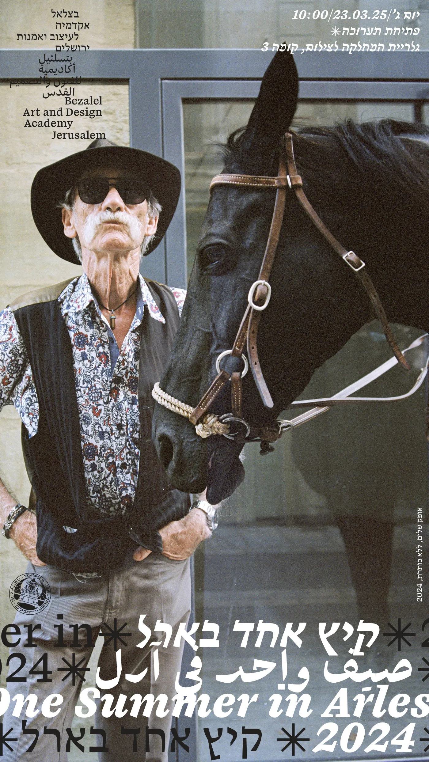
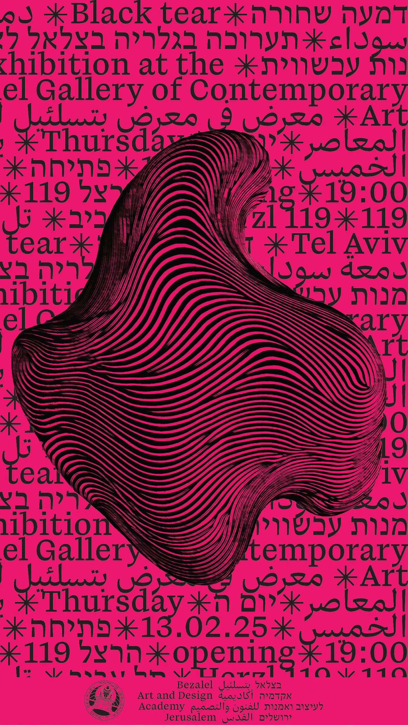
An open day, lectures and exhibitions. Each poster carries a student's image; the pattern carries the details in three languages.
04
Paperwork
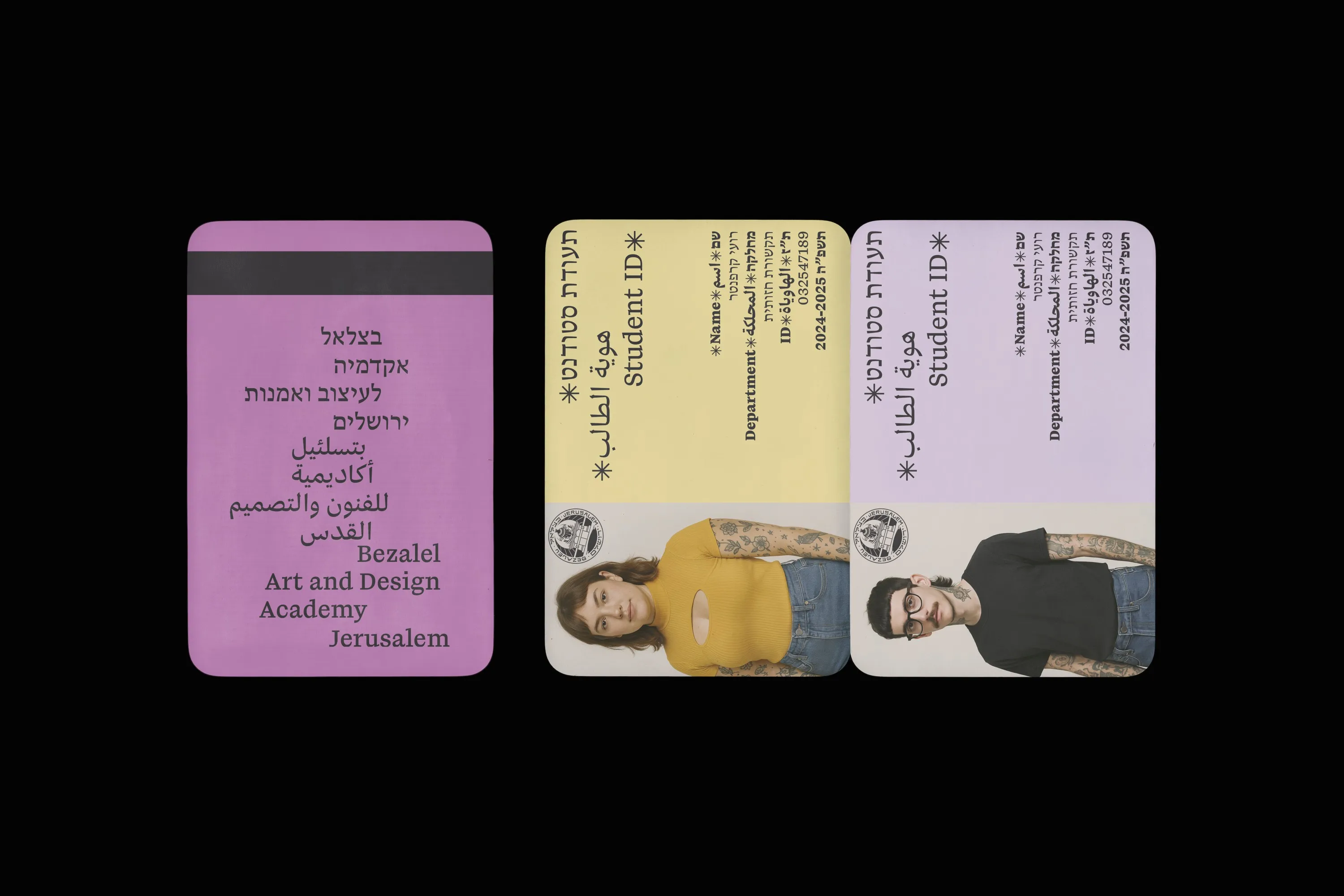
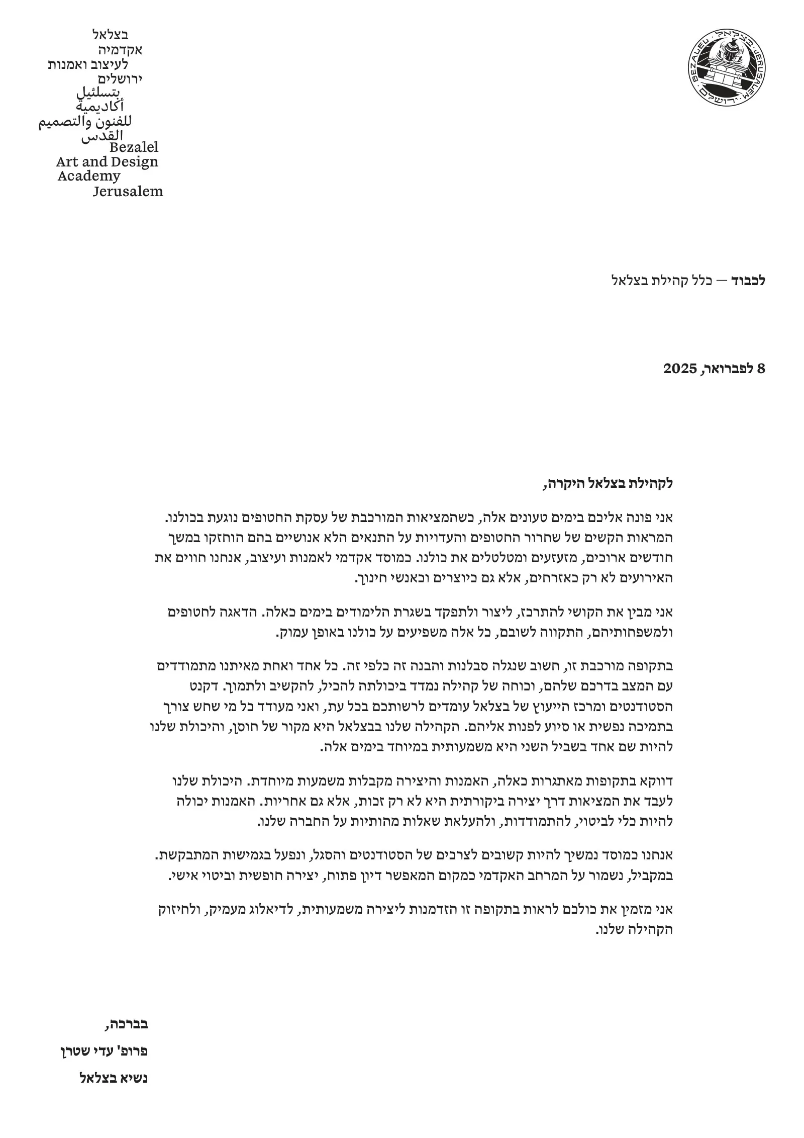
The same system runs through the everyday paperwork — student ID, registration form and letterhead — in three languages throughout. The pattern sits on the back of each sheet.

05
Website
A prototype for the academy's website, built in Figma: the opening frame, departments, galleries and study programs.
06 — Mini-brand
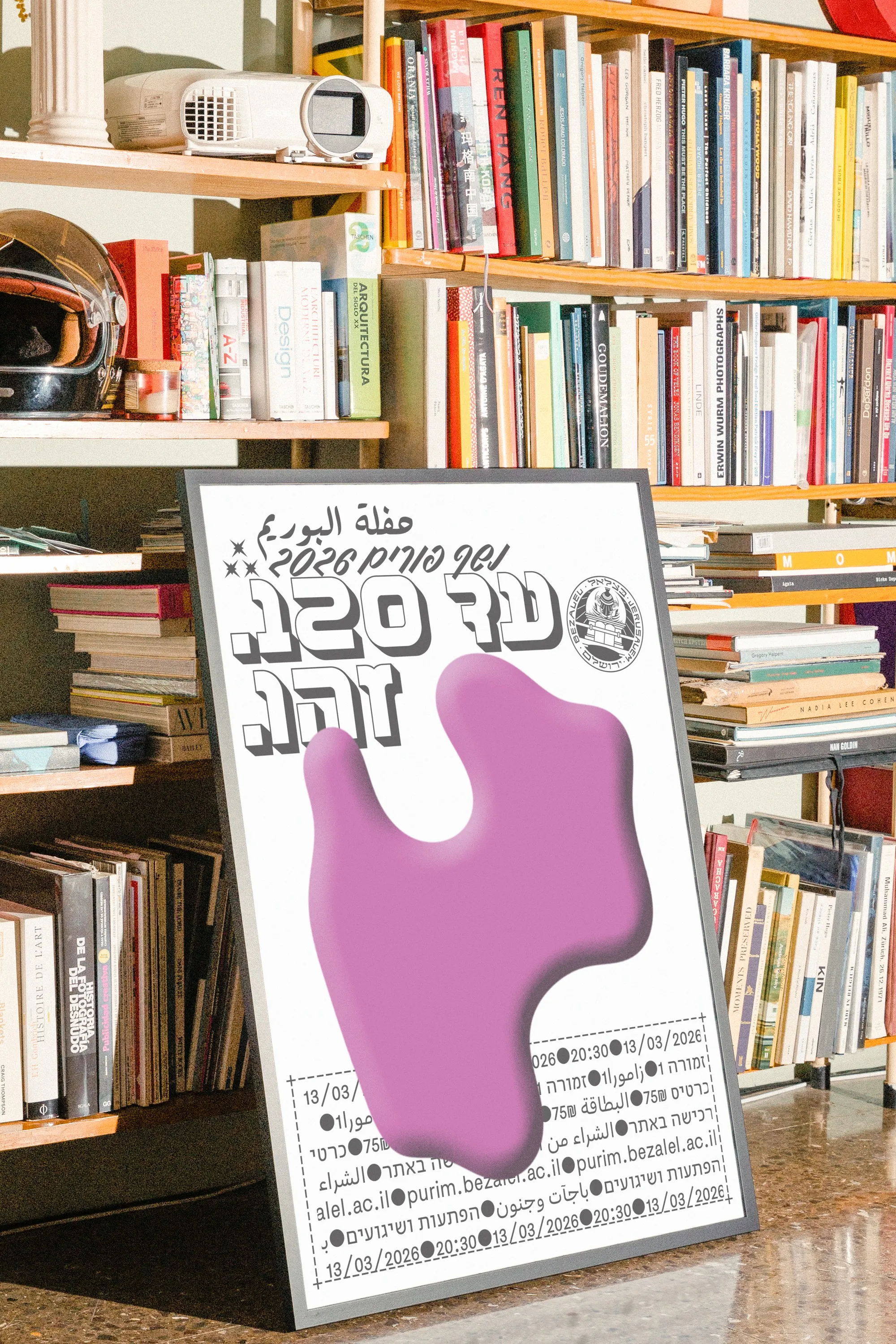
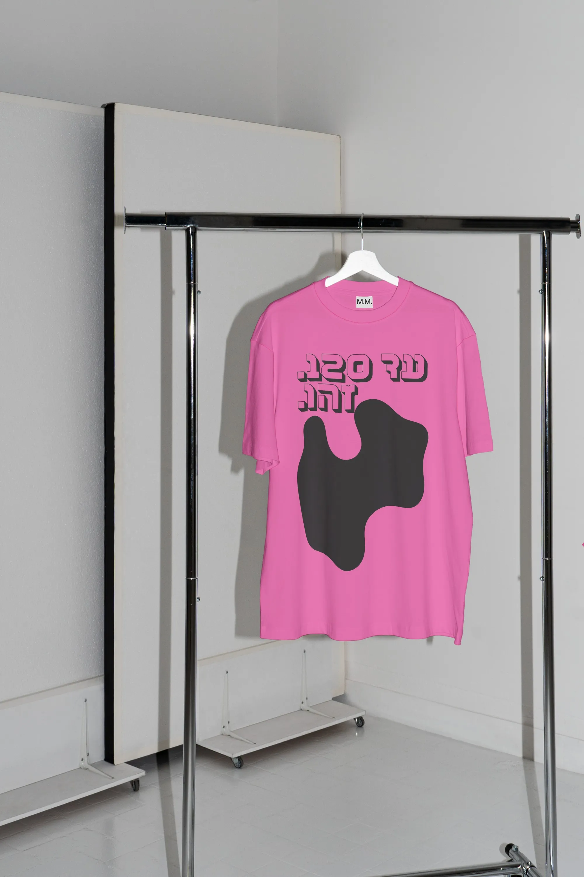
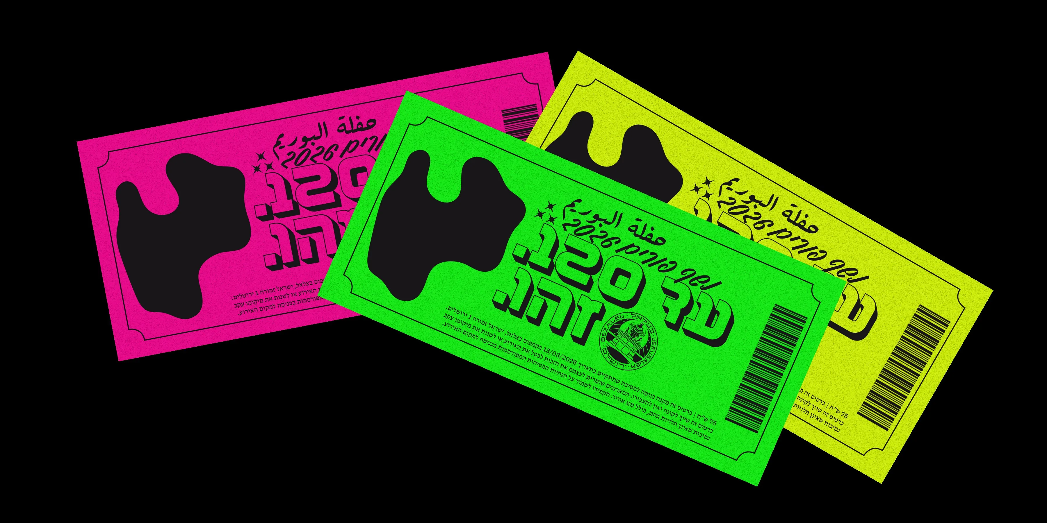
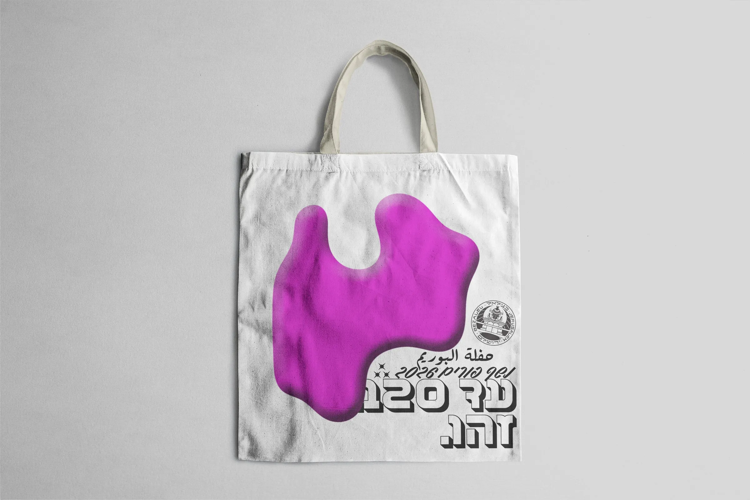
Purim Ball 2026
For Bezalel's 120th year, a mini-brand for a revived Purim ball. The pattern melts into a blob — the institution in costume, in the spirit of Purim's Adloyada. The tagline twists the Hebrew birthday wish “until 120” into “Until 120. That's it.”